The Clarus Capital Group is a Swiss wealth management company focusing on a demanding and upmarket international clientele. She is looking for an innovative implementation of the company’s philosophy for her digital and print presence. We design Corporate Design and redesign the Logo. In addition, we develop an adaptive Website and implement it.
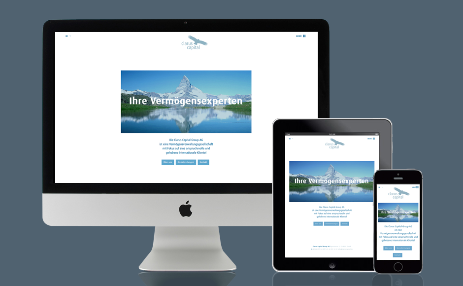
Layout, text, images optimally and automatically adapt to the appropriate screen format, regardless of the device or operating system.
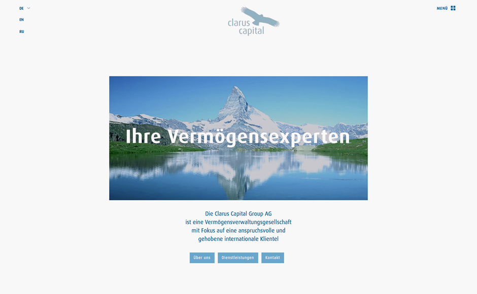
So that the actual content comes to the fore, the language selection and the navigation is displayed with hidden menus.
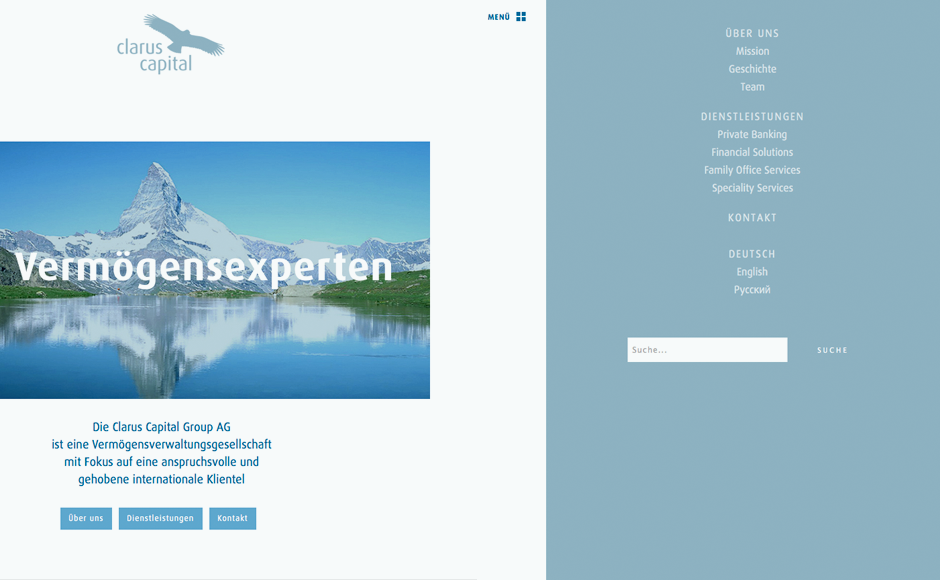
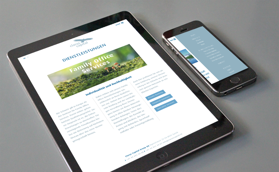
The language selection pop up by button click, the navigation is pushed in the visible area of the page as a sidebar in the Off-Canvas-Layout.
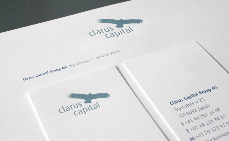
The Printed matters are refined: on Letterheads and Business Cards, the Logo is embossed.
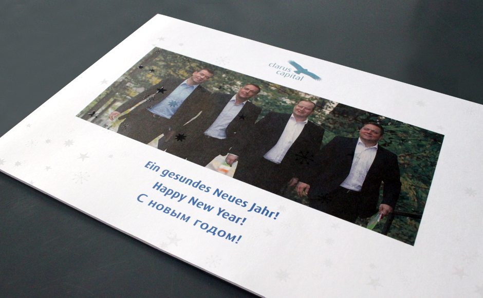
The New Year’s Card are the stars visible only through colorless glossy spot varnish.
The Corporate typeface is used continously both in the Print- and Office- as well in the Web area.
A clear, minimalist solution.