The district administration Teltow-Fläming would like to inform its visitors well and fast about attractive and varied offers. We give the web presence a modern appearance and develop a responsive and accessible web design including HTML markups.
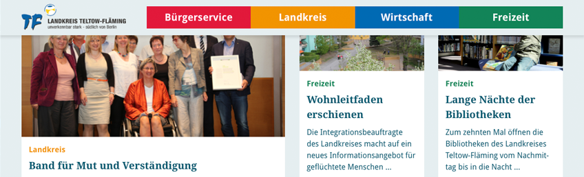
Based on a clear visual language, a collection of different Landing Page Pattern and their components are created. For the start page, news overview, article page, picture gallery, map view, contact person, database query and database output. A modular design structures all information optimally.
Orientation by appealing typography and thematic color coding
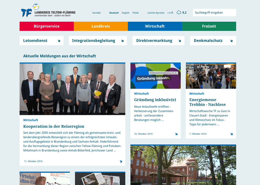
The new font is perfectly legible and is supplemented by fine typographical symbols. They fit harmoniously into the overall layout and adapt to the behavior on different output devices. By clear color coding all content can be quickly associated thematically. The new colours are optimised for good readability and give a fresh and modern overall impression.
User-friendly menu navigation
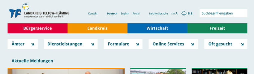
More space for content through we achieve a user-friendly and space-saving menu navigation.
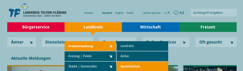
Subtle fading out of the content focuses on the navigation elements.
On all pages the use of a sticky menu allows fast navigation, which means that scrolling to the menu is meaningless.
Flexible content
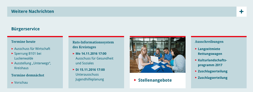
Additional messages can be switch on or off using an accordion effect. Short messages and announcements receive special attention by visually separated text boxes.
Complex content
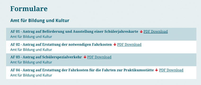
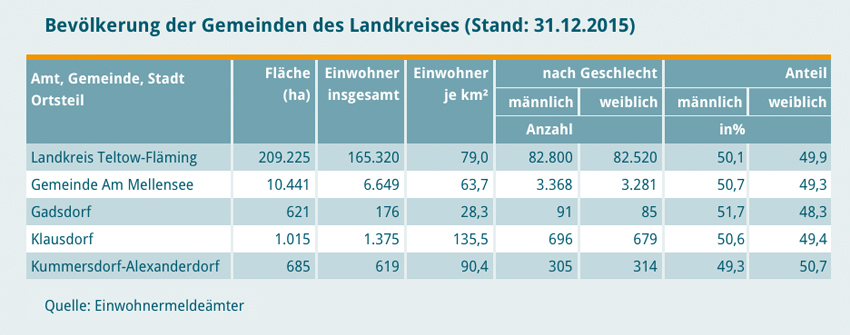 Forms and tables are clearly designed and can be quickly grasped.
A fresh performance for a district »unmistakably powerful – south of Berlin«.