At the Europe-wide competition »Information Stele of the Tourist Information System Berlin« 13 offices are coming in the evaluation. We develop the KOMPASS Orientation System. It is characterized by a clear information design – with an independent, distinctive character and high recognition value.
Iconic Circle Plan
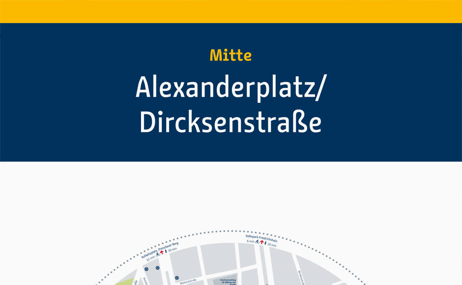
The pillar is based on the corporate design of the city’s orientation system. The circular form of the regional map has an iconic character and thus receives a higher attention. Moreover, the circular format displays all content equally from the location. The middle-axis layout reinforces this. The outer map circle of the region indicates the most important sights of the map, which follows below. A uniform family of pictograms is specially developed for the project.
Innovative Day & Night Version
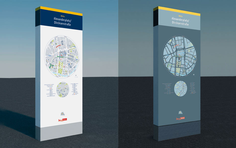
The steles are self-luminous and noctilucent. Through a special printing process, the stele appears white during the day. At night, only the plan and the script light up. This reduces the light pollution to a minimum. Nevertheless, the stele is easily recognizable from a distance by its illumination and the readability is optimal (sectoral planning designalltag.ch).
12 District Colors
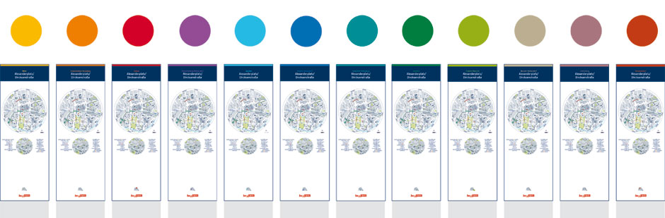
Depending on the location, 12 district colors represent the diversity of the city and create identity for both visitors and residents.
KOMPASS. A fresh and modern addition to the city’s tourist orientation system – day and night.
As a guiding point, meeting place, destination point.