For its its tailor-made investment solutions the financial service provider polarlab is looking for the suitable brand design. We are responsible for the entire corporate, web design and the imagery.
Logo family

We develop a Logo family, which maps the work processes and product areas. All logos included the compass as a symbol of orientation. The main logo is complemented by the three process logos pre-trade, at-trate and post-trade, and the four product logos equity, fixed income, foreign exchange and commodity. The color palette with the neutral main colors gray and light blue is enhanced by the four signal colors blue, green, red and orange.
Photo line: Undiscovered landscapes
Under this motto, a world of images is created, which also will be understood as a message. polarlab breaking new ground to find the best solutions for its clients.
Photo line: Product areas
These images reflect the colors of the product logos.
Corporate Design
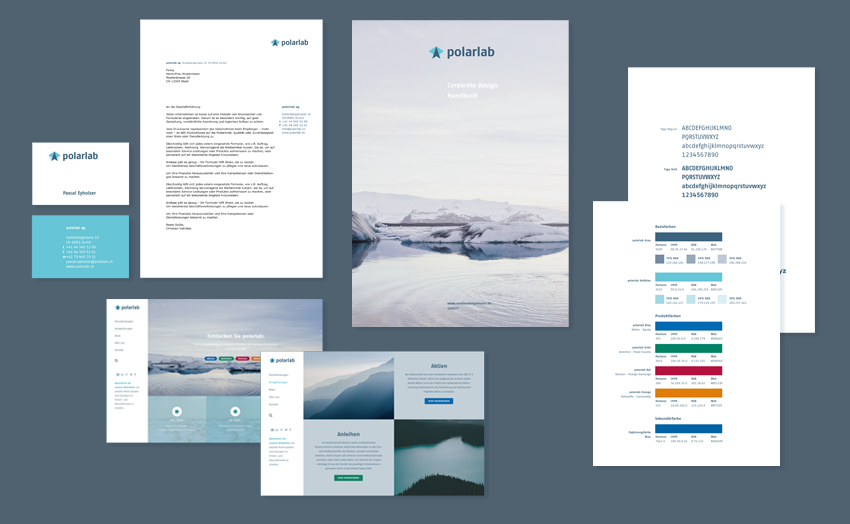
The manual documents the basic visual elements. The design guidelines ensure a uniform appearance with logo application, printed materials and website.
Web Design
You are currently viewing a placeholder content from Default. To access the actual content, click the button below. Please note that doing so will share data with third-party providers.
By the minimalist design the four product areas and the procedure of polarlab are highlighted. The logos and the dynamic network graphics represents not only for the global network of partners, analysts and brokers but also associate constellations, mountains and processes.
polarlab as a compass by the financial services.
